

Content marketing plays an essential part in establishing a brand’s presence online by helping them engage with the audience through seamless personalized digital experiences.
However, it takes time to produce, edit, and push the content online.
Given this, editors should be provided with highly flexible and accessible tools, no matter whichever CMS they use.
As there is no set standard for providing an exceptional editorial experience, there can be, however, a few things that can be considered to speed up your editorial process without compromising on the quality of the content.
For instance, if your application consists of an Article content type, then a good editorial experience can be achieved by considering the following-
- Identify the most used/important fields for the editors and prioritize them by keeping them at the top of the fields list
- Provide help texts wherever required
- Group similar field types together. For example, if there are different types of tags that content should be tagged with, then group all term fields.
- Identify how these different groups should behave. Should these groups show up as "Collapsed" while the initial loading of the form?
- Are editors comfortable with the admin themes? Or is there a scope for improving it?
- Constantly ask for feedback related to the UI/UX of the admin interface of the CMS.
Keeping small things like these in mind will help in creating a better editorial experience and ultimately improve end-user experience.
The below-mentioned points will help you in improving the editorial experience of your Drupal website through the Article content type.
Rearranging Fields :
- Re-arrange the fields on the article content type by prioritizing the most used fields on the top of the fields list, for example -
- Move all the fields that are related to the title of the content to the top (heading, subhead, Seo-headline) and then all fields related to adding the summary/body of the content, then come to the taxonomy terms and so on.
- Next, group all fields that are of the same type. For example, taxonomy terms and listing display content
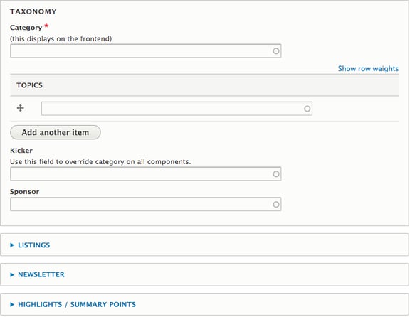
Over here, you can see that Listing, Newsletter, and Highlights fields are "Collapsed" by default and the taxonomy term field is in the "Opened" state.
Thus, it helps to reduce the page scrolling on the initial load of the form.
Providing the Lock Details on Content Listing Dashboard
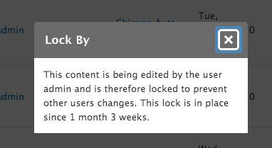
By using the Content lock module, one can avoid the "Concurrent Editing" of the content. Concurrent editing implies that when one user is editing a node, any other user that attempts to edit the same node will be blocked and notified that the content is already being edited by another editor along with the time the lock has been in place.
By default, you can get the lock information only when you are on the Node Edit page i.e. "node/<id>/edit".
The message pops up like this-
This is quite useful, however, this information only shows up on the "Node Edit" page.
So, to overcome this, we tailored the module and added the capability within it to help it display the lock information on "Admin Content Dashboard" like this-
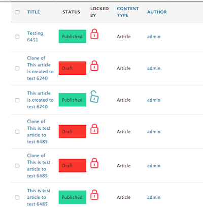 You can click on the lock and get the information like when the lock was placed and by whom, thereby reducing the time to navigate to the "Node Edit" page.
Assigning Color Code Status on Admin Content Dashboard
You must have noticed different color shades in "Status" Column beside Article Title in the screenshot given above.
By using the workflow module to create different editorial states of the content, like the draft, first edit, final edit, or published, the idea behind assigning the colors to these states is-
- To make it easy for editors to identify the editorial state of the content at the first look itself. Something that has colors catches more attention!
- Again, this saves time for navigating to the node edit page to get the state information.
In the End
These were some of the highlights of our project where we aimed at improving the editorial experience by understanding the editors’ problem from the root.
Also, getting constant feedback from editors about how easy it has been for them to add the content after the platform has been revamped can further add to enhancing their experiences.
In case, you come up with additional innovative ways of providing the best possible experience to your editors, then do share them with us in the comments below :)