

Given the facts and figures in this study, there are more than 58 percent of people who prefer their smartphones over desktop or laptop to browse information on the internet. And when those responsible for the development (at the backend) decide to go ahead without any changes for the mobile, the users start getting annoyed. So much so, that 39% of them stop engaging if images don’t load or take too long to load.
In this blog, we will explore some of the awesome Drupal 8 modules for image optimization and how they can help websites reach their desired user experience.
Drupal 8 Modules For Image Optimization
Fortunately, Drupal 8 has many useful and out-of-the-box image optimization modules that makes it most appealing among website owners also who look forward to upgrading to Drupal 8.
Read on to find out about those modules that can help you in image optimization-
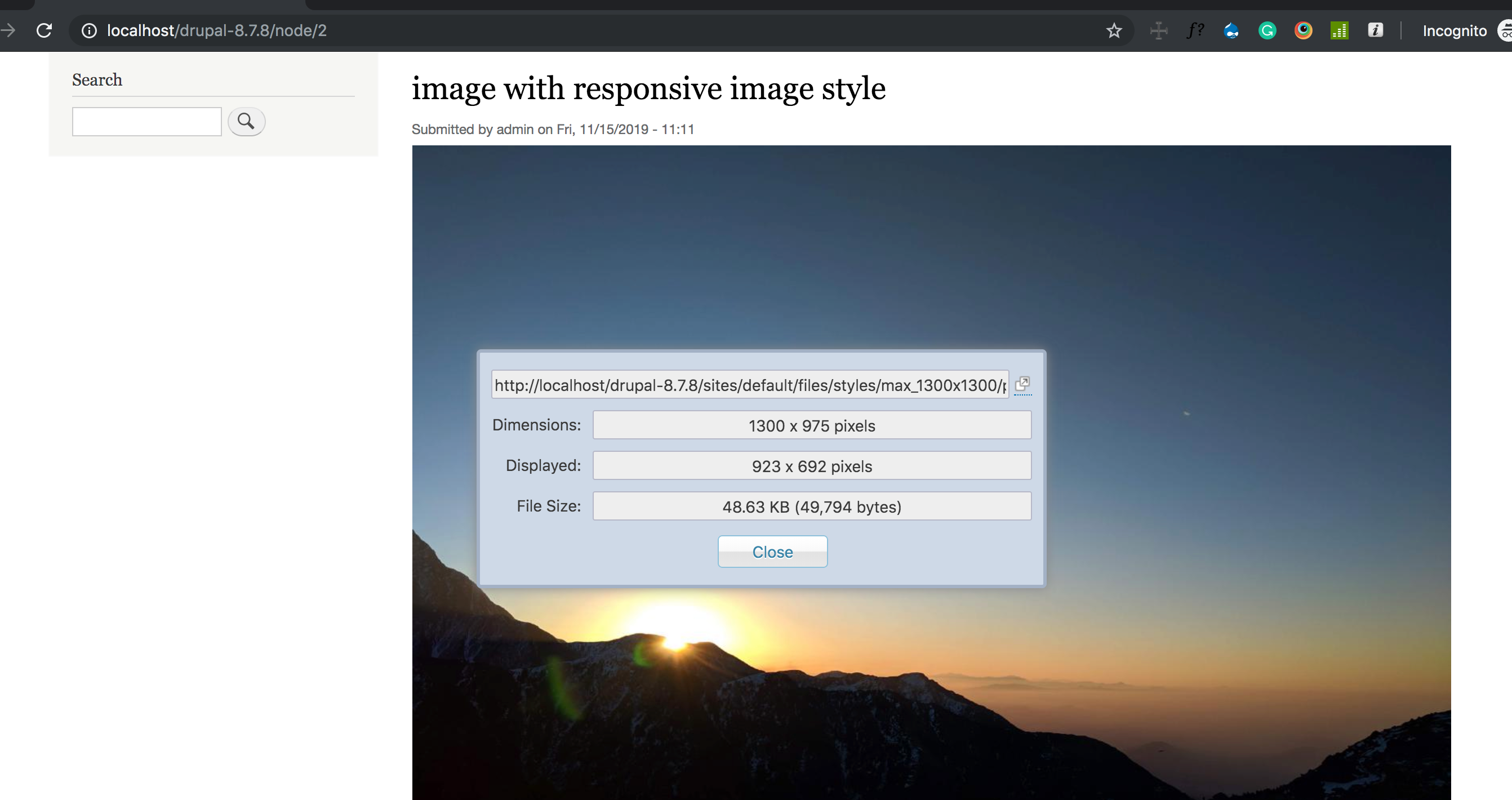
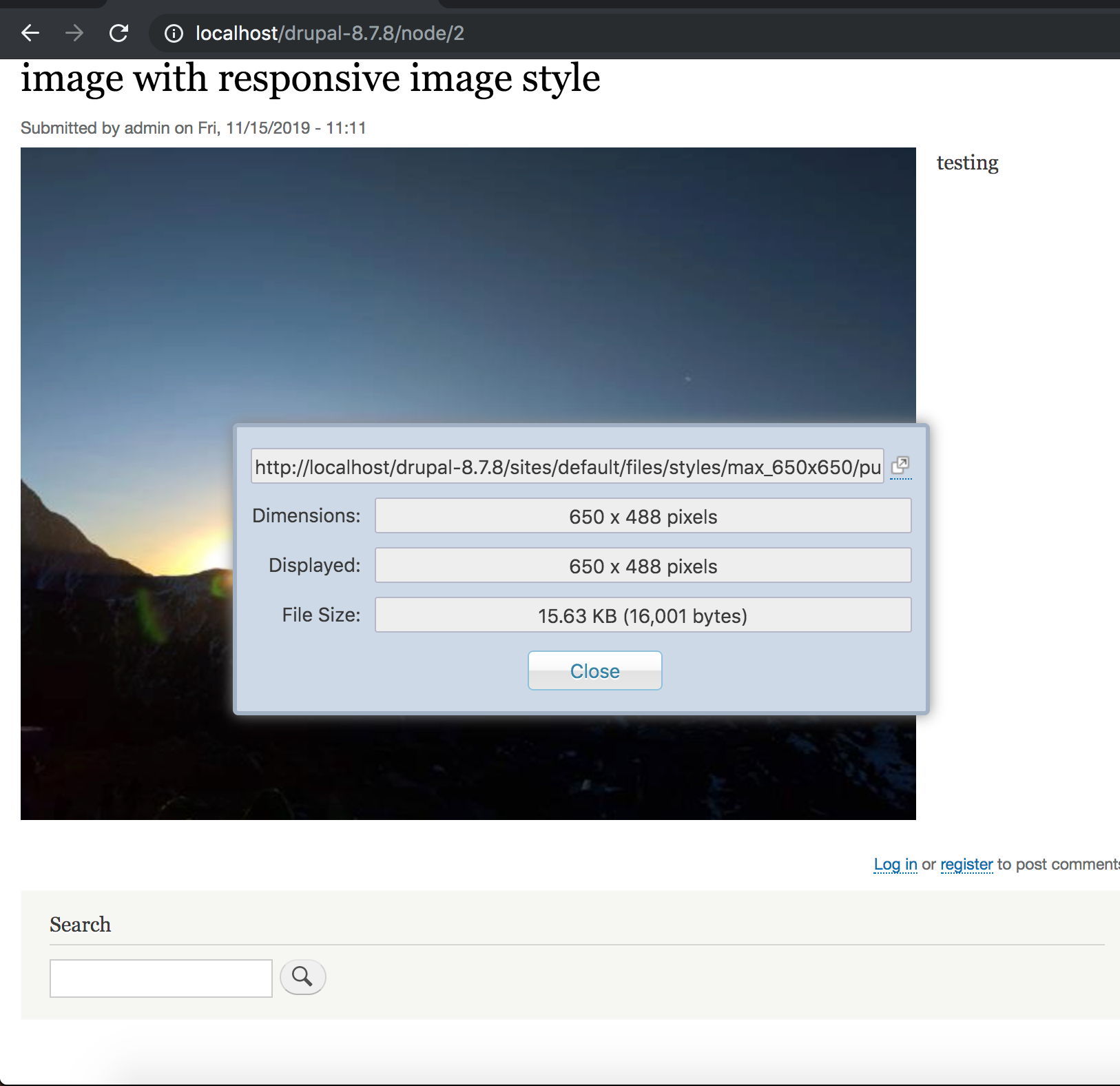
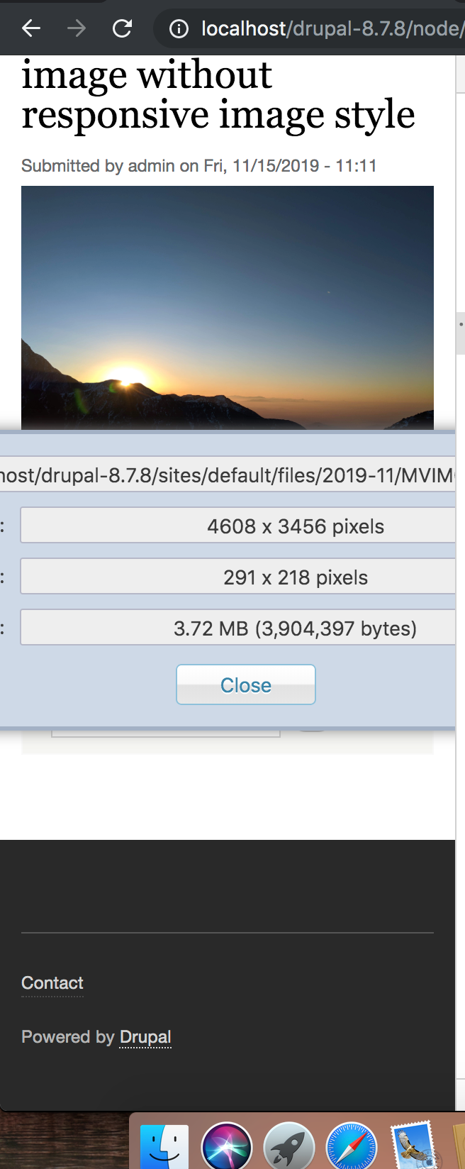
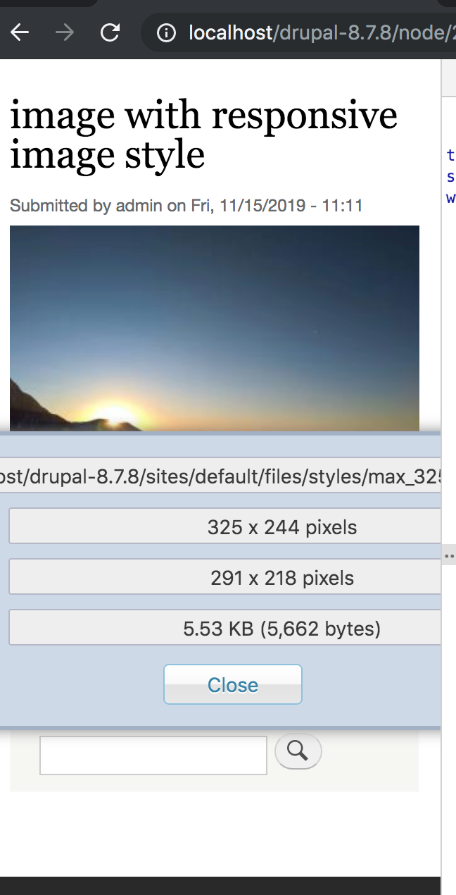
The Responsive Image module in Drupal 8 encompasses an image formatter and breakpoint mappings to deliver responsive images using the HTML 5 picture tag. It comprises of fallback support for Internet Explorer 8. To get images in IE8 that are not tweaked for a mobile interface, you’ll need to configure the fallback in your display to use your desktop image size rather than “automatic”.
How to Set Up Responsive Images in Drupal 8
Following steps will help you in easy setup of responsive image module-
Step 1: Enable the responsive image module
One of the major changes in building responsive images in Drupal 8 from Drupal 7 is the responsive image module being part of Drupal’s core - there is no need to download an extra module. However, this feature is not enabled by default.
-
To enable the responsive image module, go to " Admin" > "Configuration" (/admin/config).
- Click the checkbox next to "responsive Image".
- Click "Install".
Step 2: Setup breakpoints
If you are using a default theme like Bartik, there is no need to create a breakpoints.yml file. Default themes already have this file.
Step 3: Setup the image styles for responsive images
Step 4: Responsive image styles
We will now assign the image styles with the breakpoints, to create the Responsive Image styles.
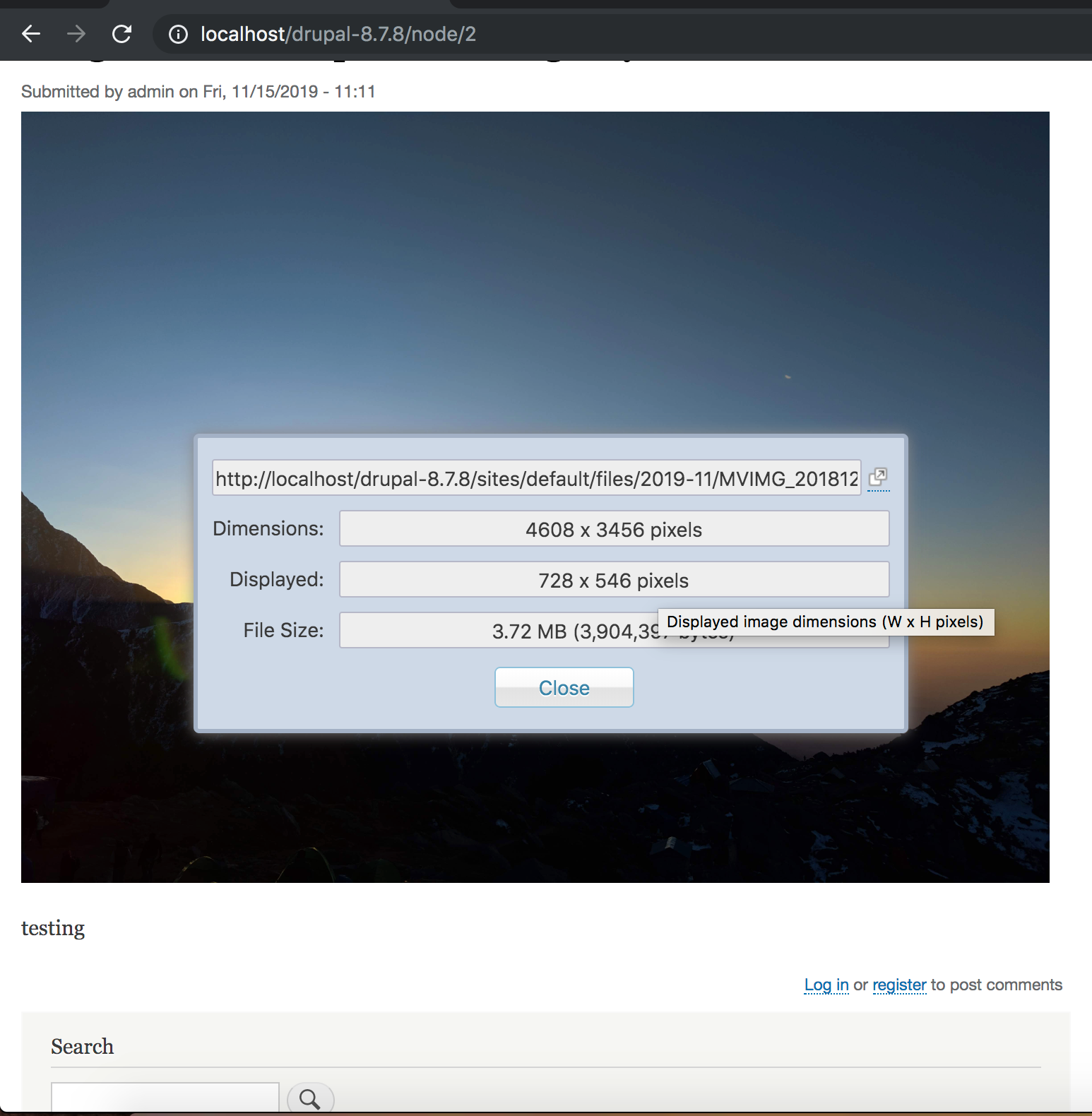
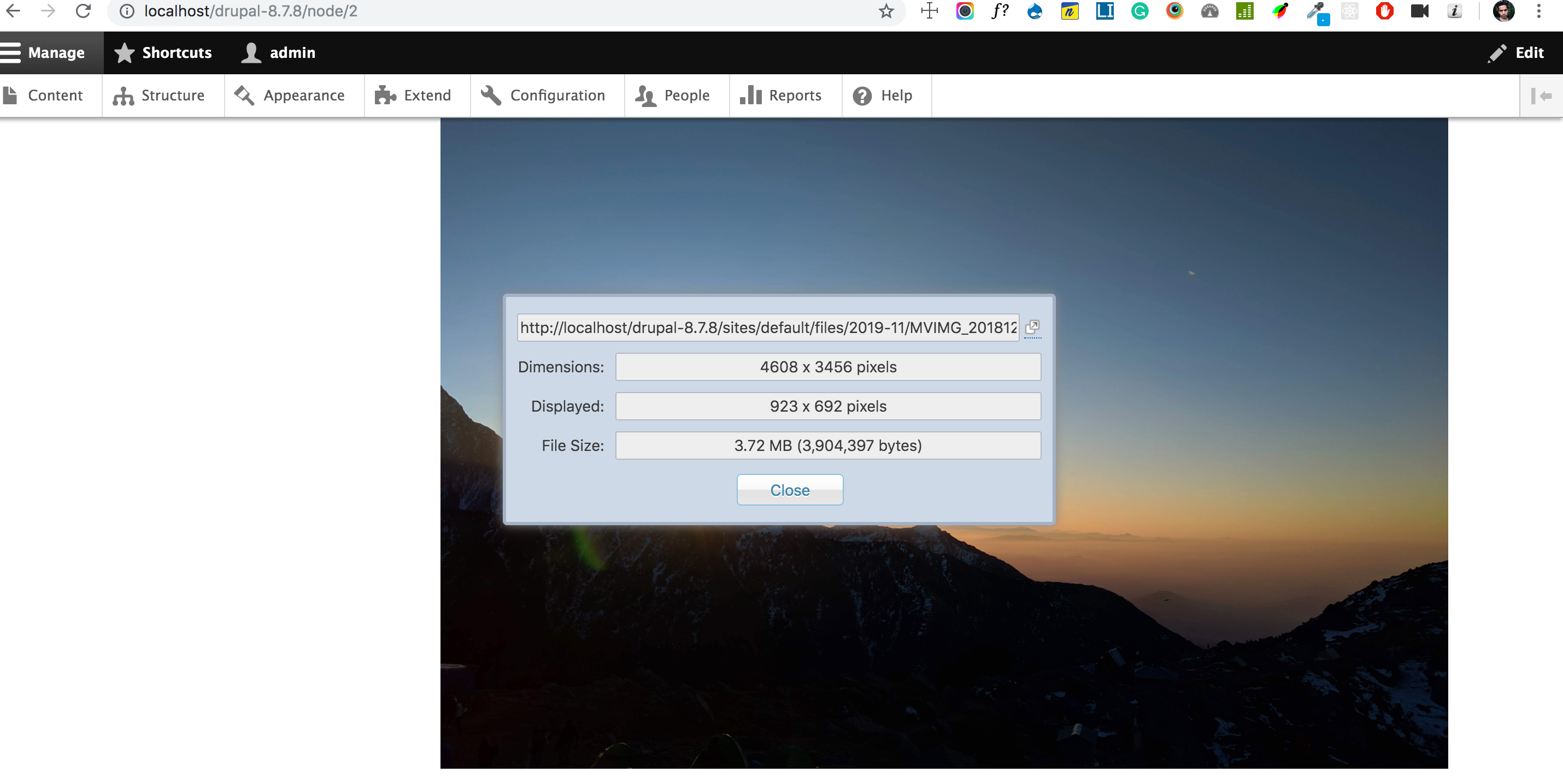
Below mentioned is the result of how a responsive image style, once set up, can turn the tables.
|
Devices |
Without the Responsive Image Module |
With the Responsive Image Module |
|
Desktop |
|
|
|
Tablet |
|
|
|
Mobile |
|
|
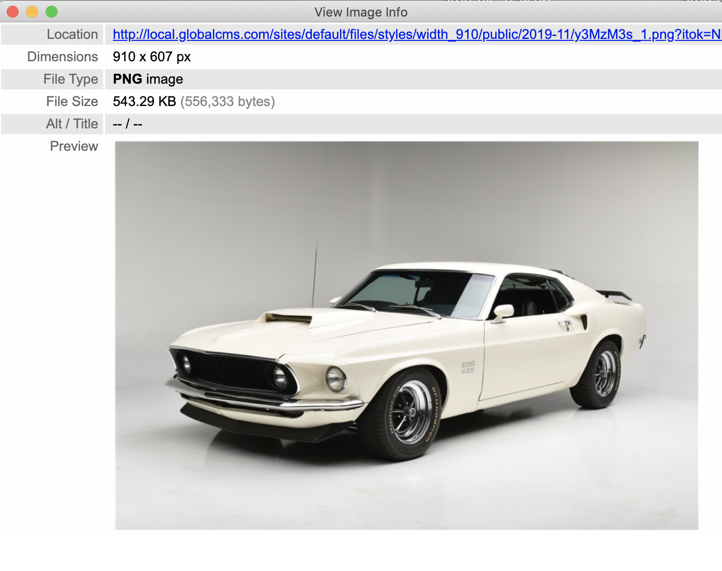
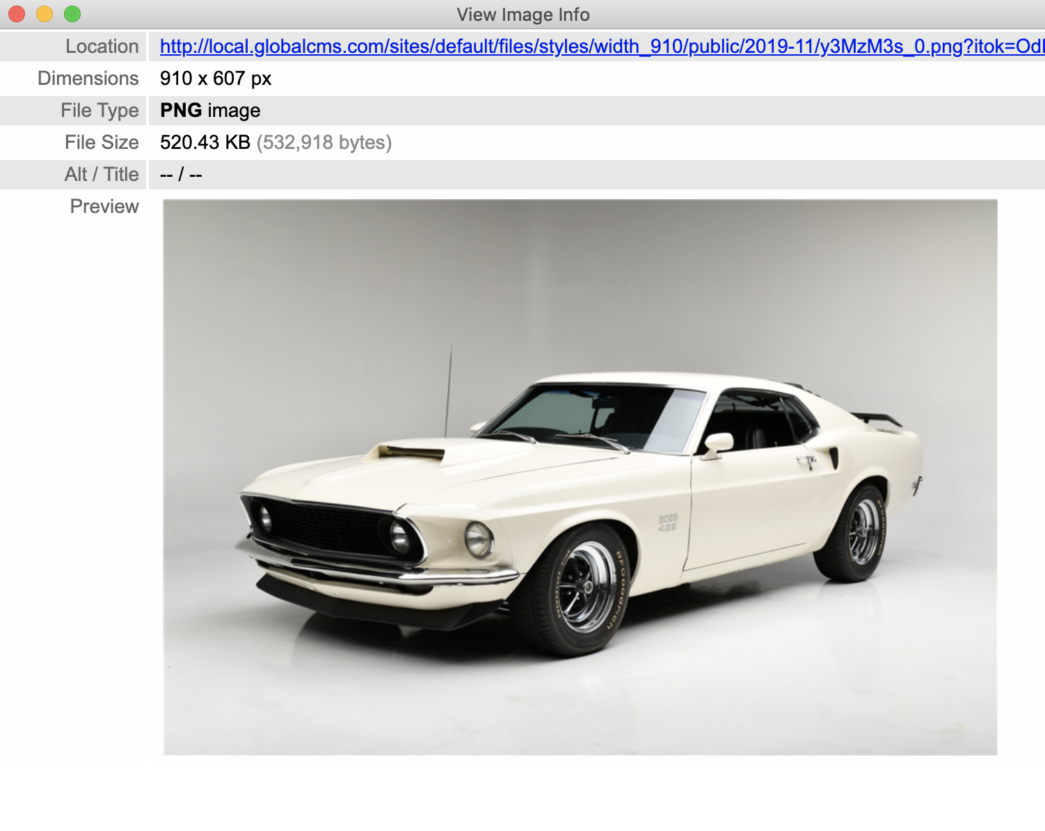
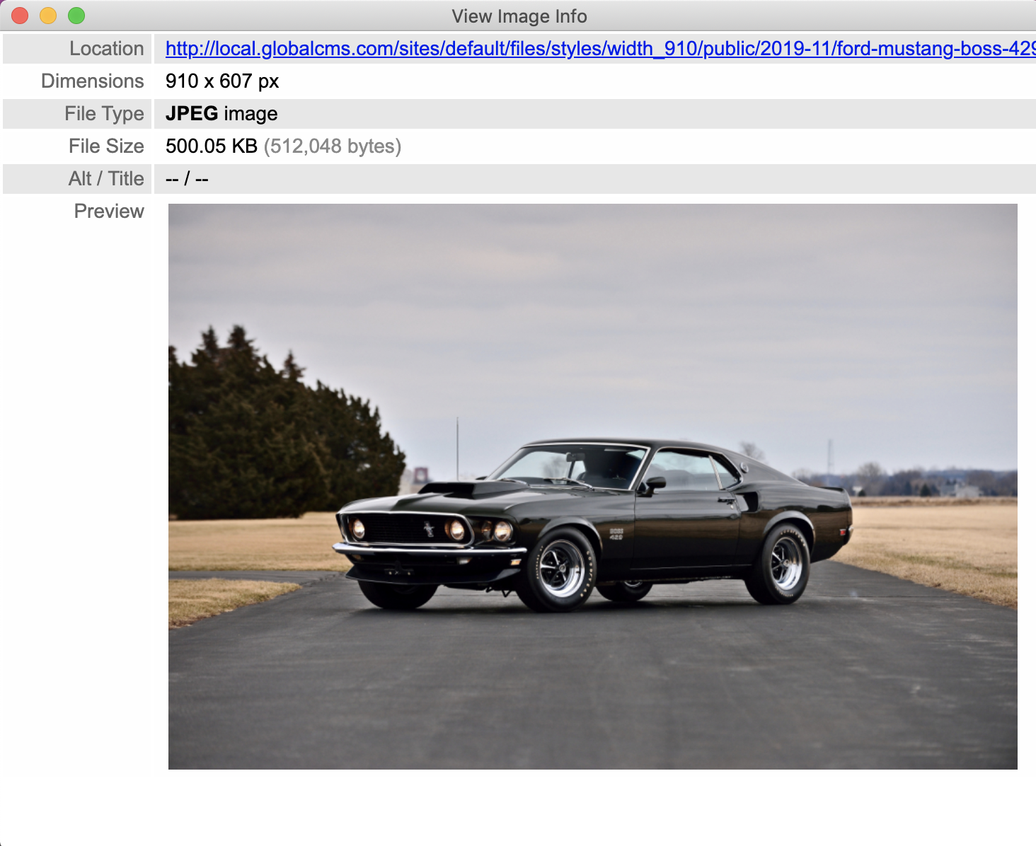
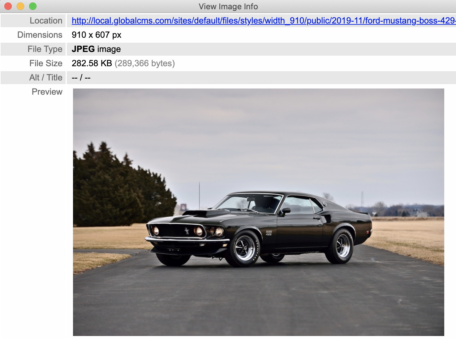
Drupal by default comes with the GD2 image manipulation toolkit which helps the image cache module to create different sized alternatives of the same images. While GD does most of the work, it lacks some important features like converting/supporting gif with image style, & supporting of some extra image formats like TIFF. At this point, we need to use ImageMagick to extend support for gif format with an image style.
Follow the given steps to start with ImageMagick-
1) Install the module by running the following command
Composer require 'drupal/imagemagick'
3) Select the ImageMagick image toolkit and configure the image quality to 100%.
By implementing the module, the following improvements can be observed:
1) The gif image format support is now enabled when used with an image style.
2) 20-40% decrease in image size
Please refer to below table for detailed output-
|
Image Format/ Toolkit |
GD2 Toolkit |
ImageMagick Toolkit |
|
PNG |
|
|
|
JPG |
|

|
|
GIF |
|
|
Note: ImageMagick is preferable over the GD toolkit due to the functionalities it provides.
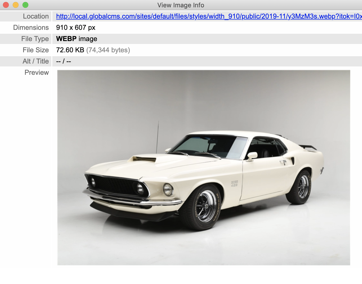
WebP format is one of the image formats developed by Google, capable of reducing the image size by 20-50%. Some of the dependencies which WebP module had before being used in Drupal are as below:
1) At least one image library (GD2, ImageMagick.). In our case, we are using ImageMagick.
2) Images to be rendered using a responsive image style as the WebP module works with <picture> tag only. Any image which is not rendered using picture tag is not converted to WebP form and remains in its original format.
Note: In some browsers, WebP format is still in testing mode. WebP module detects the unsupported browser and renders the original format image instead of WebP format.
Use the below steps to get started with WebP -
1) Install the module by running the following command
composer require 'drupal/webp'
3) Configure the image quality to 100%.
Below are the improvements that can be noticed on the site alongside a decrease in image size by 20-25% -
Please refer to below table for detailed output-
|
Image Format / Configuration |
With ImageMagick and without WebP |
With ImageMagic and WebP |
|
PNG |
|
|
|
JPG |
|

|
|
GIF |
|
|

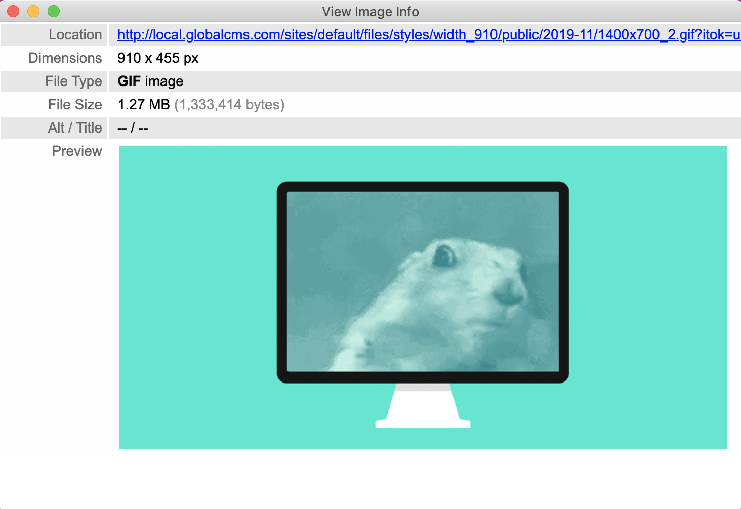
Note: Please note that the size of the gif image remains the same in both cases - with and without WebP. The reason is that WebP does not support gif images on some browsers. Hence, we have excluded the gif by applying a patch on the WebP module.
Summing up:
The bounty you get against the efforts you put in is the website images that look vibrant and crisp on all touchpoints, while still downloading efficiently. Users won’t leave your sites disgruntled anymore as images won’t take forever to download; making a huge difference to your engagement ratio, conversions, and other sales activities.
Drupal is a powerful, robust, and scalable website content management system that ensures every element on the website functions well to deliver a seamless digital experience to users. Using its modules, you can surely manage the images efficiently witnessing the boost in site performance.
(Co-authored by Sumit Kumar)