
.jpg?width=100&name=banner_appsec%20(1).jpg)
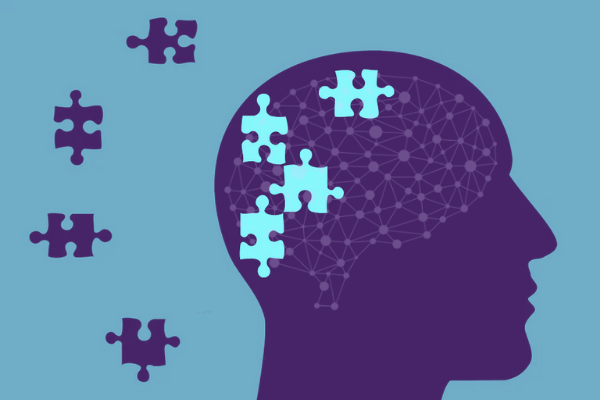
Understanding user behavior is paramount when designing any type of product, be it digital or traditional. The way people perceive certain things will affect how they interact with them, the pleasure that is driven from said action, or the overall experience they have.
Before diving into the actual development of a digital product, UX designers need to plan their every step by maintaining a user-centered perspective. They need to think like the users, identify their needs and what stimulates a particular action or reaction. For that, there is one single type of science that we can use – psychology.
This does not mean you need a master’s degree in behavioral science to deliver great digital experience. But by understanding some of the most basic psychology principles, you can elevate your design and provide users with enjoyable experiences.
Understand the Basics of Human Attention
In simple words, attention is the ability to process the information around us and select what stimuli we react to. Sometimes, these reactions happen automatically, like when someone calls our name, while other times we get to decide what we want to react to, often called the focus. Right now, your brain processes a huge number of stimuli, such as the light in the room, the sounds we hear, or the voice in your head that reads these words. However, your decision at that particular moment might be to focus on the voice.
When it comes to visual attention, there are two ways people can choose to direct it. The first one, spatial attention, refers to focusing on a particular region, such as the main page. The second one, feature-based attention, dives even deeper and shifts focus to one single element; a particular color or word, for example.
But attention is a limited resource, which means UX designers need to focus on not overloading the mind. This brings us to Hick’s Law, which states that the more choices someone has, the higher the cognitive load. To put it simply; the more choices you give to a user, the harder it will be for them to decide which action to take. On the other hand; limited, but more clear options, will lead to a much better user experience and drive satisfaction.
However, there comes a time when you need to feature a large number of options, and you can’t afford to cut back on any of them. In this case, you can break the process up into steps similar to that of the menu bar of an eCommerce store.
Gestalt Laws of Perceptual Organization
Commonly referred to as the Gestalt Principles, these laws present the fact that human minds tend to group elements in certain ways, for a much easier way of processing stimuli around us. Basically, the mind does this to help break up complex schemes or images. Try looking at these Rainmeter skins, for example, and how designers managed to group different elements on the desktop for better UX.
Since every person is different, you might be tempted to think that the way we group these elements is different or random. In reality, they all fall under 5 principles:
- Proximity: This principle refers to the fact that we tend to group elements that are close to each other and perceive them as one single item
- Similarity: Elements that look alike, probably because of color, shape, or some other feature, are tend to be grouped together
- Continuity: Our minds are designed to follow paths. So, you can use the principle of continuity to guide the user towards a certain element on a page.
- Closure: Our brain is used to process a whole image better than multiple bits. So even though an element is missing, you will still perceive the bigger picture as an entire unit
- Connectedness: The simplest out of all 5 principles - this refers to the fact that we have a tendency to group items that are connected, kind of like a big painting fragmented into three separate sections.
We Favor What We Find Familiar
Another psychology principle, called Jakob’s Law suggests the fact that people tend to favor experiences they find familiar. How can we leverage this to deliver a good UX design? Well, it means that people are more likely to react positively to websites or apps that look similar to those they have been using before.
However, this does not mean you should go ahead and copy Uber’s interface if you are designing a rideshare app. It only means that you may want to keep the same principles.
To apply Jakob’s Law, you need to first identify the leaders of the industry and see what elements they have in common. Think of it as a spin on a traditional recipe. A hamburger without a bun and a patty is no longer a hamburger, but this does not mean you can’t add lettuce, cheese, or your secret sauce to it.
By keeping the key elements together that users are familiar with, you can avoid confusion and succeed in meeting user expectations. Paper writing sites, for example, focus on maintaining a few basic elements, such as the type of services they provide, samples, and contact information as visible as possible, because these are the main features that people look out for.
Don’t fear that keeping a familiar structure will limit your chances to provide innovative features. By conducting market research, you will be able to identify the areas in which can do something different.

Get Familiar with UX Writing
Besides images and other visually pleasing elements, effective UX designs need to correctly incorporate texts also. While we might be used to guide ourselves based on graphic elements, such as icons and pictures; the text helps with call-to-action.
Try to imagine an app that is solely based on graphic elements. No written information, no guidelines, no help menu, nothing. Would it be easy for you to navigate through it? But, most importantly, would it be easy for someone else who is not as tech-savvy as you are, to work their way around it?
The text needs to be incorporated into the development process since its early stages, to ensure they blend and go well with the rest of the design elements. Otherwise, developers might have to rectify the initial design to ensure that it fits the text elements.
Bottom Line
A few basic psychology principles can help you go a long way in the UX design process. By understanding how the mind of the user works, you will be able to shape up your design and influence the way people interact with the app. Still unsure? Try observing these principles in the apps or websites you visit every day and see if they have any role in how you interact with them. You are in for a surprise.
**This post is written by our guest author Jessica Fender. She's a blogger and Chief Content Officer at OnlineWritersRating.com.
Interested to write for us? Drop a mail at guestpost@srijan.net with your awesome ideas.