The visualization journey started with brainstorming and identifying variables that are thought to be associated with life expectancy. This was followed by researching information from government sources. Information organized in various excel sheets was then used with tableau public to explore and analyze the patterns in data.
BI tools allow an analyst to quickly plot data in various possible ways with ease. The story depicted through this visualization follows a structured thought process. We created interactive data visualizations using tableau, which succinctly captured the various correlations, making the data easier to process and analyze.
We started off with plotting information points across variables to explore relationships and trends. A large number of factors were shortlisted to be analysed, but due to paucity of data, many had to be dropped. The factors depicted in this study are therefore not necessarily exhaustive, but are the ones where we either had the data available or which were found to have significant relationships(correlations).
The Data Visualization
Here's a look at our findings, with interactive data visualizations using tableau:
Our Findings
Life Expectancy in India
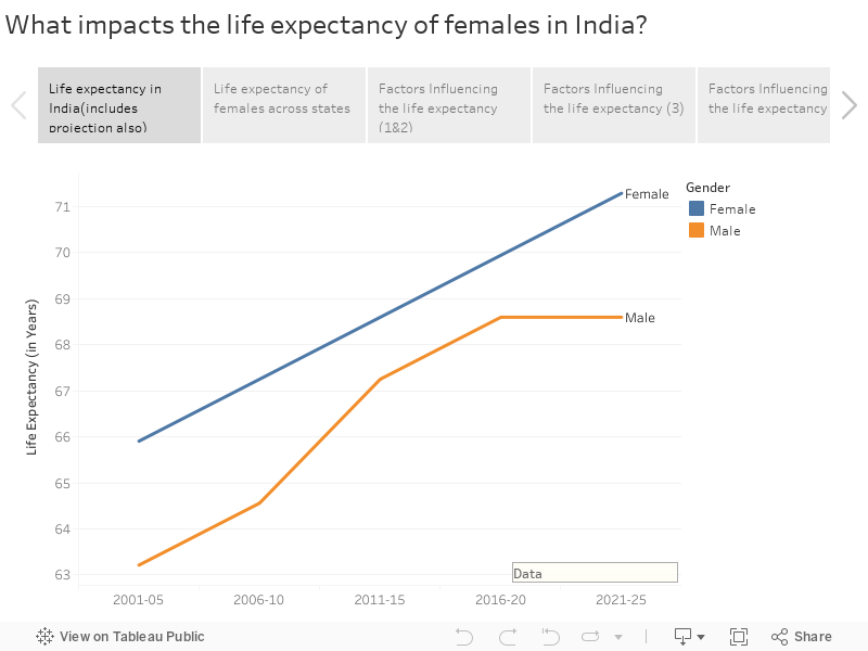
To set the context, we chose the first graph to depict life expectancy figures for males and females over the years. Life expectancy is growing at a steady rate for both males and females in India, due to improved access to healthcare facilities, education, and sanitation. Increase in per capita income has improved the average Indian's access to nutritious food and other needed resources .
Life Expectancy of Females across States
The second visualization shows the variation in life expectancy patterns of females in the country. Maximum life expectancy is in Kerala and the least in Assam. Southern, western, and certain pockets of north India have better life expectancy than rest of the country.
Factors Influencing Female Life Expectancy
The data exploration exercise threw up some significant correlations:
Sanitation: Topping the list is non-availability of latrine facility in the household premises. Although the correlation is not extremely high, but one could characterize it as a moderately strong relationship. Several other studies in the past also cite this trend. A campaign run by the corporate house Unilever has shown similar results in Thesgora, a village in Madhya Pradesh, where the simple practice of washing hands has dramatically reduced the mortality rate for children below 5 years of age. This village is infamous for the highest rates of diarrhoea in the country.
Literacy Rate: The second strongest association is the correlation with literacy rates. A more interesting analysis could also have been based on higher levels of education and not just literacy. Education brings awareness, and also favours the adoption of better practices like eating nutritious food, regular visits to hospitals, institutional deliveries etc.
Quick fact: A recent analysis by the famous statistician and writer Nate Silver revealed that it was education and not income which predicted who would vote for Trump.
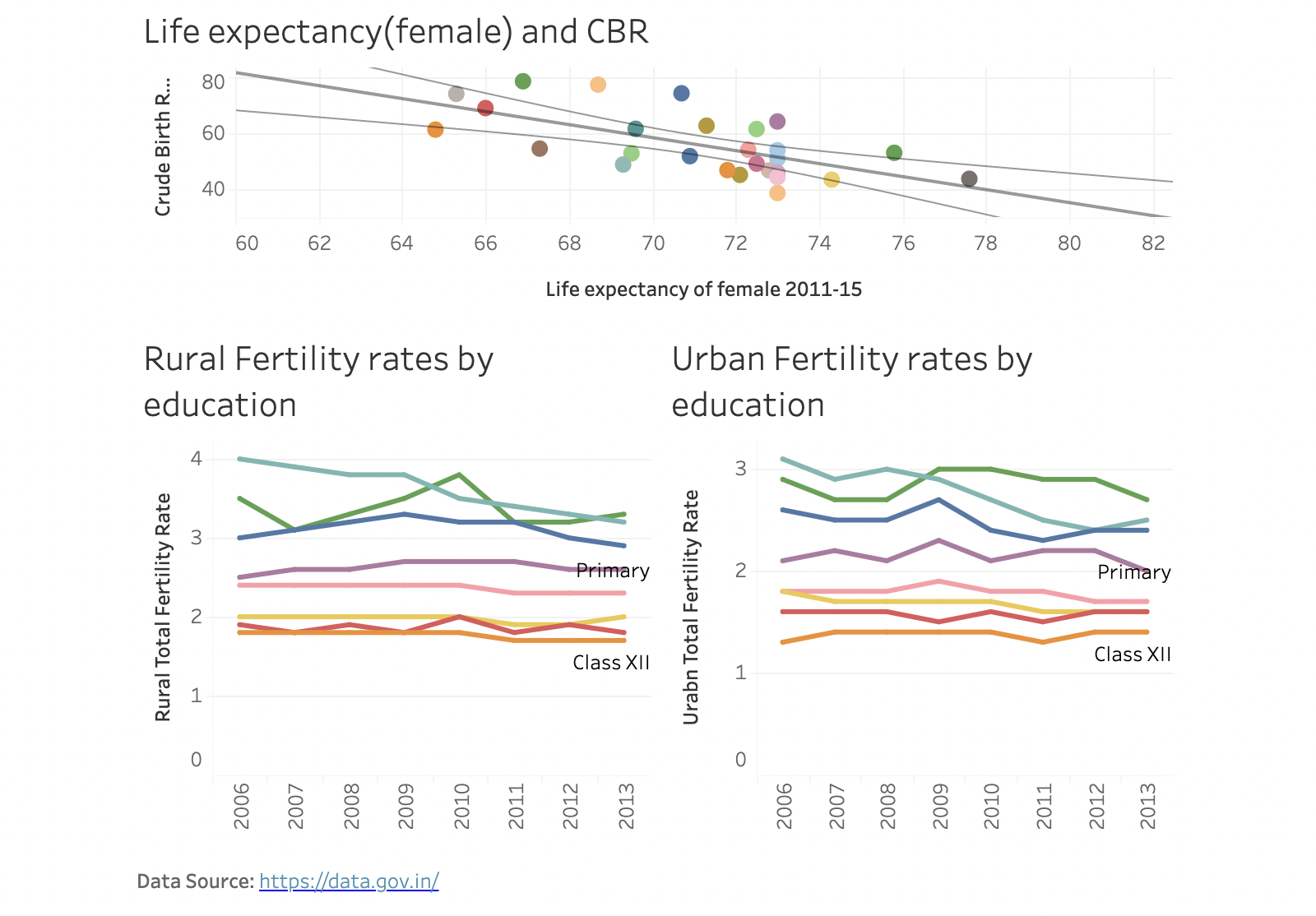
Fertility Rate: The third strongest factor impacting the life expectancy was found to be crude birth rate, i.e. the number of children a woman is likely to give birth to. The smaller the family size, higher the life expectancy across states, which is in turn strongly related to education levels. Higher the education level, lower the number of children born. This trend was observed in both the urban and rural datasets.
Per Capita Income: The last significant variable was found to be per capita income, which was analyzed using net state domestic product across states. Decent income levels ensure access to resources, which is very important to live a quality and healthy life. However, what is more interesting is, in the list of significant relationships, income levels took the 4th(last) place whereas better sanitation facilities and education levels stood stronger than income levels.
We would like to add that some obvious correlations were not found be statistically significant. For example, correlation between the availability of required hospital staff and life expectancy. This could be due to the lack of quality data.
Please let us know your comments and feedback on this exercise. We would love to hear about any other ways this data could be analyzed, or other interesting insights that could emerge with data visualization using tableau.