
The dashboard uses data.gov.in as the source and attempts to understand the key trends in crop production in India over the years.
A scatter plot of area vs. production reveals some key insights:
1) Key crops by production over the years
2) Relationship between area under production and production
3) The magnitude of production
4) Changes in crop production pattern over the years
It can be seen that a simple visualization has unfolded many hidden facts. Wheat, rice, and sugarcane are the three consistent largest produced crops over the years. Not only has this quick visualization uncovered some good insights, it also has paved way for the next set of questions which come to an analytical mind, like:
1) What percentage of total production is accounted for by these three crops versus the area they occupy?
2) Are there some other crops where the ratio of production to the area is much higher than these three crops?
3) Why are only these three crops produced on a large scale?
4) Are there commercial reasons behind the production of these crops or are they produced mainly for local consumption?
5) Could we map import/export data to make more sense out of this data?
6) Would an overlay of rainfall data explain the shifts in the pattern of crop production? and so on…
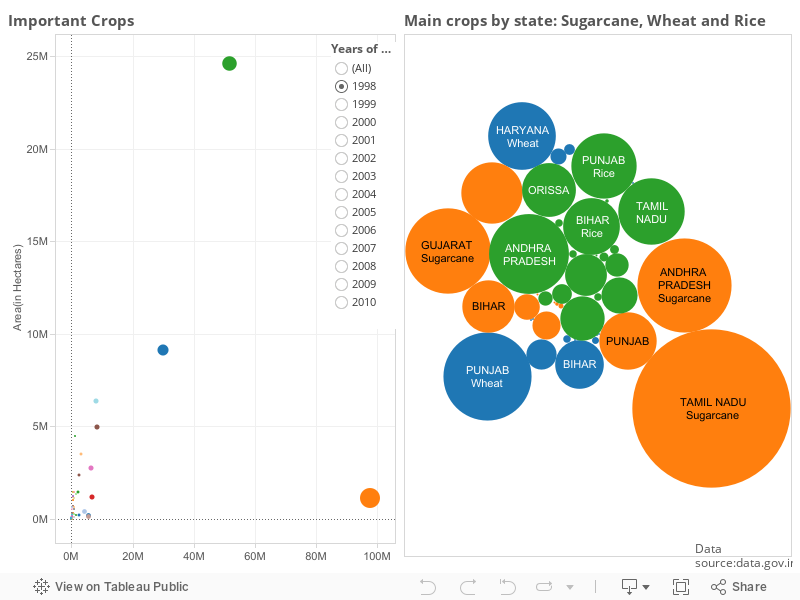
Besides this, the bubble chart visualization throws light on the key states contributing to the production of these crops over the years. The key insights include the following:
1) States contributing the most to the aforementioned three crops (the size indicates the magnitude of production) over the years
2) The contribution of the same states across the three main crops
3) Shifts in states’ contribution to the main crops over the years
The clear next set of questions are:
1) Are the land holding sizes impacting the shifts in states producing these crops?
2) Has the area under the production been impacted by urbanization?
3) Are there specific districts within a state that contribute most to the production?
4) Have the districts/areas with the best rainfall produced the most?
5) Have state-specific policies impacted the production of specific crops?
The next set of dashboards and visualizations will attempt to answer these questions, and would probably raise more questions unless the story is complete. Watch out this space for more on this story-building through some more interesting visualization.