
Grid or Flexbox?
While CSS Flexbox offers a one-dimensional layout model powerful alignment and space distribution, CSS Grid lets you quickly create flexible and two-dimensional layouts.
They can both be used to place, size, align and architect the website designs.
But dimensions aren’t the only value proposition between the two. Let's learn about CSS Grid and Flexbox together!
The Fundamentals
The CSS Grid Layout offers a two-dimensional grid-based layout system, with rows and columns. It makes designing web pages easier, without having to use floats and positioning.
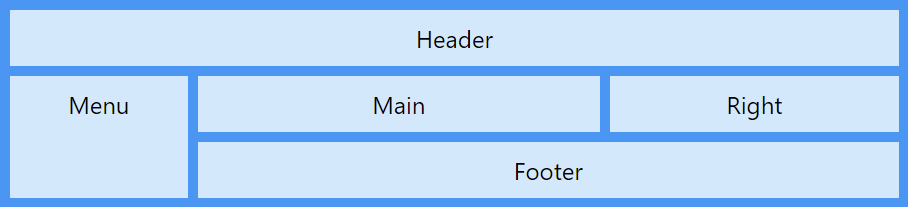
Layout design of CSS Grid
The CSS Flexbox offers a one-dimensional layout. It is helpful in allocating and aligning the space among items in a container (made of grids). It works with all kinds of display devices and screen sizes.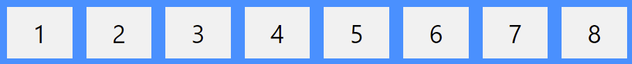
Layout design of CSS Flexbox
A Quick Comparison
| Element | Grid | Flexbox |
| Dimension | Two dimensional | One dimensional |
| Support type | Layout-first | Content-first |
| Page Responsiveness | Yes | Yes |
| Other features | Can flex a combination of items through space-occupying features | Can push content elements to extreme alignment |
| Browser Support | Firefox, Chrome, Safari, IE10+, IOS Safari | Firefox, Chrome, Safari, IE10+, IOS Safari, Opera |
Let’s take a look at the two major points of difference between Flex and Grid
One vs Two Dimension
Grid is made for two-dimensional layout while Flexbox is for one. This means Flexbox can work on either row or columns at a time, but Grids can work on both.
When working on either element (row or column), you are most associated with the content. Flexbox, here, gives you more flexibility. HTML markup and CSS will be easy to manage in this type of scenario.
However, when working with the overall web page layouts, CSS Grid does away with the nightmares of coding. It gives you more flexibility to move around the blocks irrespective of your HTML markup.
Content-First vs Layout-First
Another major difference between Flexbox and Grids is that the former works on content while the latter is based on the layout. Let’s take a quick look:
Flexbox
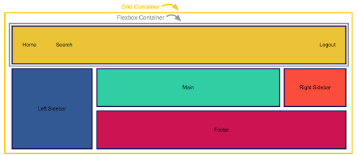
Let’s say we want to recreate this design in Flex

HTML:
 <header>

   <div>Home</div>

   <div>Search</div>

   <div>Logout</div>

</header>
CSS:
header {
   display: flex;
}
 header > div:nth-child(3) {
  margin-left: auto;
}

Items will place automatically in one line and you don’t have to add anything else except display: flex ;; so the items are free to take their appropriate place.
Let’s see how we will achieve the same design with CSS Grids.
header {
   display: grid;
   grid-template-columns: repeat(10, 1fr);
}

Although they both look similar, the difference in layout can be seen with Chrome dev tools.

Can you see the grid columns & content? So what did Grid actually do?
It divided the wrapper into 10 columns and placed each item into those grid cells. It forced us to divide the layout into 10 columns. But this limitation was not there in the flexbox since it adjusts the items automatically.
We move forward with shifting one element (say, log out) to the extreme right.
Here’s how we do it.
header > div:nth-child(3) {
   grid-column: 10;
}


In this case, we are forcefully moving log out to the last column, which is wrong.
This is how it will look like when we will combine both the header and other web page blocks.
Conclusion
- CSS Grids helps you create the outer layout of the webpage. You can build complex as well responsive design with this. This is why it is called ‘layout first’.
- Flexbox mostly helps align content & move blocks.
- CSS grids are for 2D layouts. It works with both rows and columns.
- Flexbox works better in one dimension only (either rows OR columns).
- It will be more time saving and helpful if you use both at the same time.
While Grid and Flexbox can be defined as the parent-children element, both have their own strengths and limitations. It is wise to understand their ability before deciding upon which one to choose.
Looking for frontend expertise? Connect with us at business@srijan.net and let our experts handle your worries.