

Adoption of smartphones and tablets is rapidly increasing with the passage of time, which is further increasing importance of mobile-friendly websites.
Studies show that nowadays, people expect pages to load in two seconds or less. Slow websites are the main reason people leave e-commerce websites. People expect things to load faster on mobiles as well.
The web has always acted like a stabilizing agent for competing priorities like SEO, marketing, performance, and now device diversity. To manage diversity, many people are moving into responsive web design solutions.
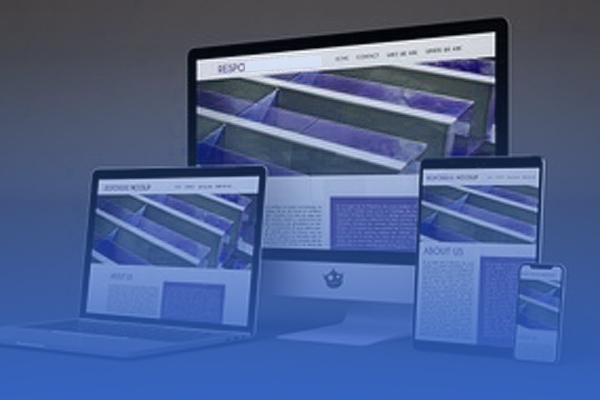
We can say that a website is responsive, when the layout and/or content responds based on the size of the screen it’s presented on. A responsive website automatically changes itself to fit the device you’re reading it on. Responsive design has been directed at generally four screen sizes: the widescreen desktop monitor, the laptop, the tablet, and the mobile phone.
Elements of responsive web design:
A site designed with RWD uses CSS3 media queries, to adapt the layout to the viewing environment—along with fluid proportion-based grids and flexible images:
- Media queries permits the page to use various CSS style rules, which are based on the traits of the device the site is being displayed on, generally the width of the browser.
- Fluid grid concept entails page element sizing to be in relative units like percentages or ems, in place of absolute units like pixels or points.
- Flexible images are sized in relative units, so that it can be prevented from displaying out of their containing element.
Almost everyone is talking about responsive designs these days and that too with a strong opinion.
Our Services
Customer Experience Management
- Content Management
- Marketing Automation
- Mobile Application Development
- Drupal Support and Maintanence
Enterprise Modernization, Platforms & Cloud
- Modernization Strategy
- API Management & Developer Portals
- Hybrid Cloud & Cloud Native Platforms
- Site Reliability Engineering